 登陆
登陆题目详情
填空题 阅读下列说明、效果图和代码,完成移动端布局. 【说明】 在某项目中,项目中的文件包含index.html、style.css和images文件夹.请根据现有的代码和效果图补全代码(1)-(5) 【效果图】 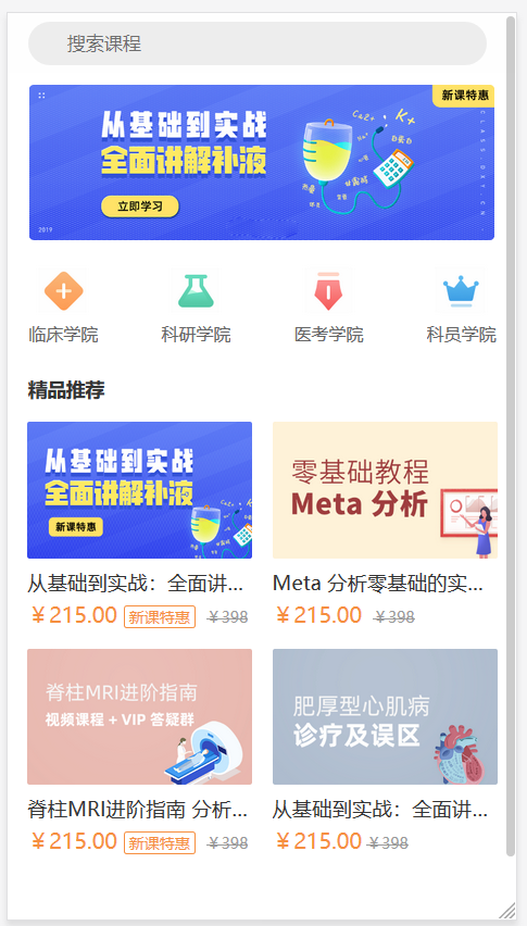 【index.html】参考附件素材资源 【style.css】 html, body, div, dl, dt, dd, ol, ul, li, h1, h2, h3, h4, h5, h6, p, textarea, th, td { margin: 0; padding: 0; } html,body { color: #333; margin: 0; height: 100%; font-family: '微软雅黑'; font-weight: normal; } * { box-sizing: border-box; } a { text-decoration: none; color: #000; } img { width: 100%; height: auto; display: block; border: 0; } body { background: #fff; color: #666; } ul,ol{ list-style: none; } .clearfix::after { clear: both; content: ""; display: block; } .header{ height: 44px; position: relative; display: flex; z-index: 102; background:#fefefe; } .header .center{ -webkit-box-ordinal-group: 3; ____(1)_____;/*设置弹性盒子*/ justify-content: center; align-items: center; height: 44px; width: 90%; margin-left: 4%; } .search-box { background: #ededed; border-radius: 22px; position: relative; width: 100%; margin: 0 auto; height: 32px; } .icon-search { position: absolute; background-image: url("../images/index.png"); left: 8px; top: 0.4rem; background-size: 19px; } .search-box input { width: 100%; background: none; border: none; font-size: 0.85rem; text-align: left; height: 32px; border-radius: 3px; padding: 0.55rem 0 0.55rem 1.8rem; } .scrollView { width: 100%; height: 100%; _____(2)_____;/*剩余空间全部分给该盒子*/ overflow-y: auto; overflow-x: hidden; position: relative; padding-bottom: 53px; } .slider-wrapper { display: flex; width: 96%; margin:0 auto; transform: translate3d(0px, 0px, 0px); position: relative; z-index: 1; padding:0.55rem; } .slider-wrapper img { width: 100%; height: auto; display: block; border: none; } .item { width: 96%; margin:0 auto; padding: 0.5rem; position: relative; overflow: hidden; ____(1)_____; justify-content: space-between; } .palace-grid .palace-grid-icon{ width: 40px; height: 40px; margin:0 auto; } .palace-grid .palace-grid-text { display: block; text-align: center; color: #333; font-size: 0.85rem; _____(3)_______;/*阻止换行*/ _____(4)_______;/*文字溢出显示省略号*/ overflow: hidden; padding-top: 0.2rem; } .palace-grid .palace-grid-text h2 { font-size: 0.8rem; font-weight: normal; color: #666666; } .flex { display: flex; align-items: center; padding: 15px; position: relative; } .flex h1 { flex: 1; min-width: 0; font-size: 14px; color: #333; } .list-theme{ width: 96%; margin:0 auto; display: flex; flex-wrap: wrap; justify-content: space-between; } .list-item { width: 46%; margin: 0 2% 2% 2%; background: #fff; display: block; overflow: hidden; } .list-theme-message { background: #fff; padding: 0.3rem 0; } .list-theme-title { color: #333; font-size: 0.92rem; margin: 0.2rem 0; overflow: hidden; font-weight: normal; _____(3)_______;/*阻止换行*/ _____(4)_______;/*文字溢出显示省略号*/ } .list-theme-message p { color: #f68f40; font-size: 0.99rem; font-weight: 500; height: 1.5rem; } .list-theme-message p i { font-style: normal; font-size: 0.7rem; border: 1px solid #f68f40; border-radius: 2px; padding: 0 0.2rem; } .list-theme-message p em { font-style: normal; font-size: 0.7rem; padding: 0 0.2rem; color: #999999; ____(5)_____;/*删除线*/ } 素材下载:
  第五题.rar
学科:响应式Web开发
时间:2026-05-21 22:58:46
相关题目
相关作业
 题目1题目2题目3题目4题目5题目6题目7题目8题目9题目10
下载 题海APP
拍照搜题更快捷
- 海量题库
- 无搜索限制
- 快捷拍照搜题